In anticipation of the opening of its seventh location, Henry’s sought a brand that honored the original but considered the tech-minded South Lake Union neighborhood.
Henry’s SLU
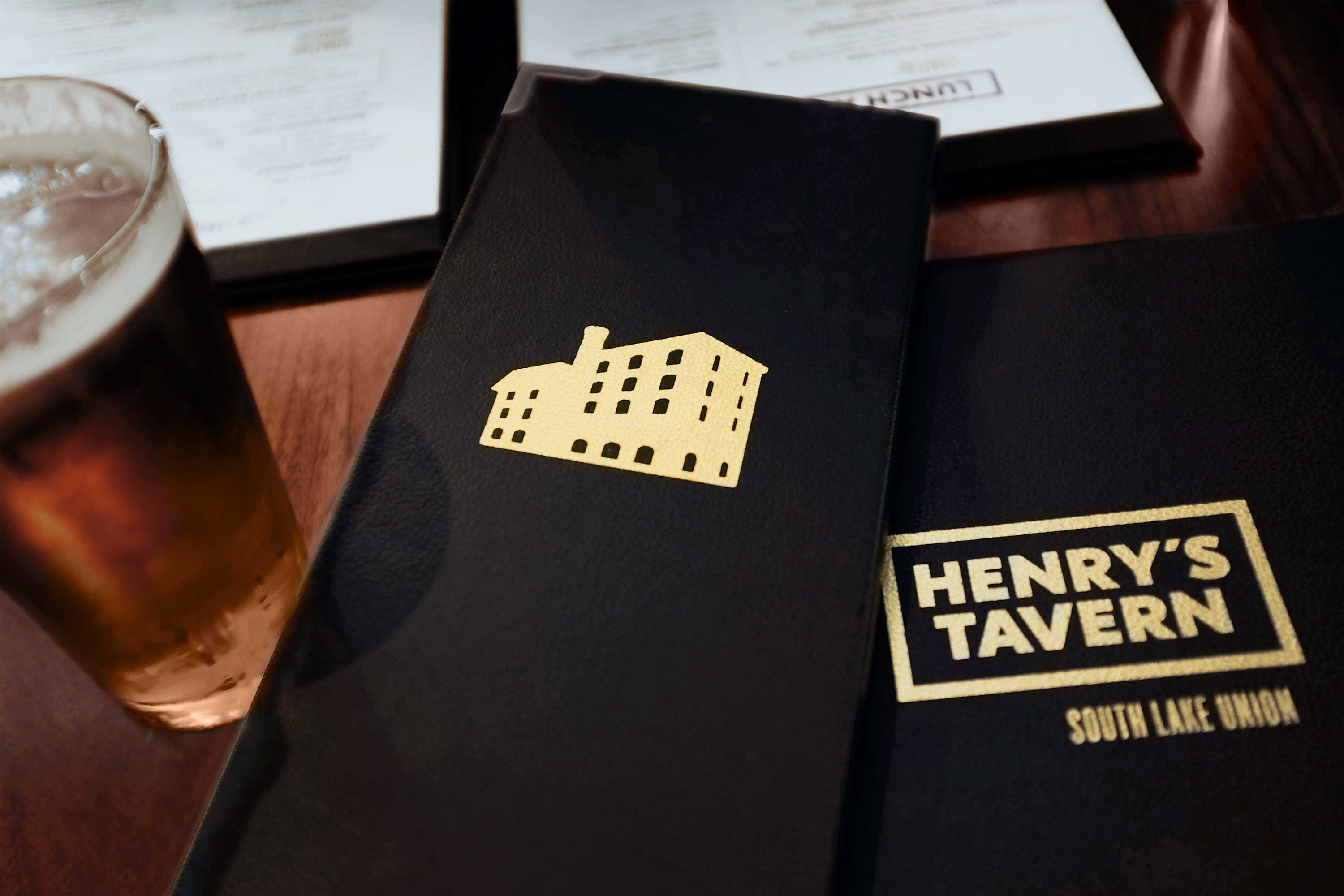
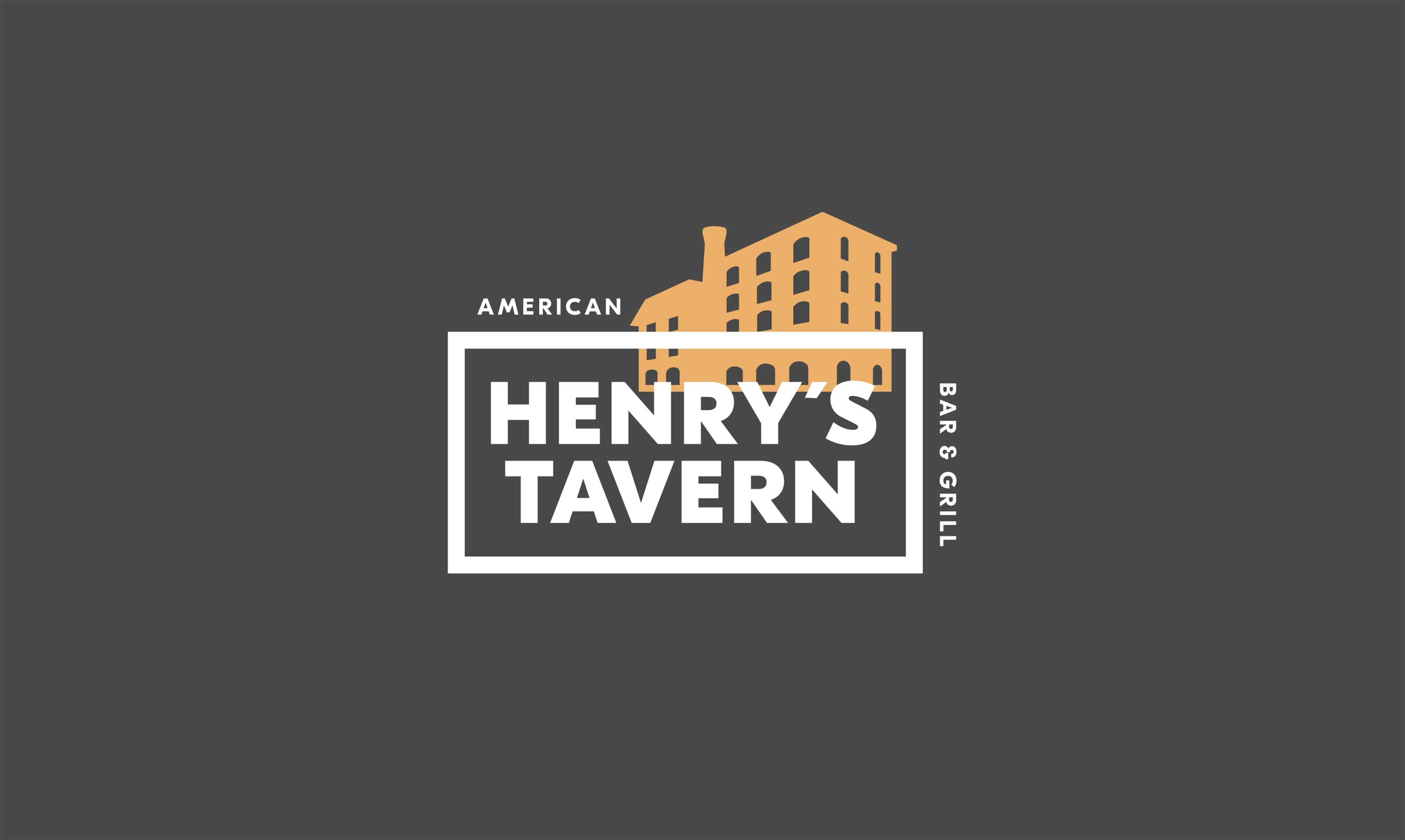
Hum evolved the existing logo to appeal to South Lake Union sensiblities, while nodding to Henry’s rich history.
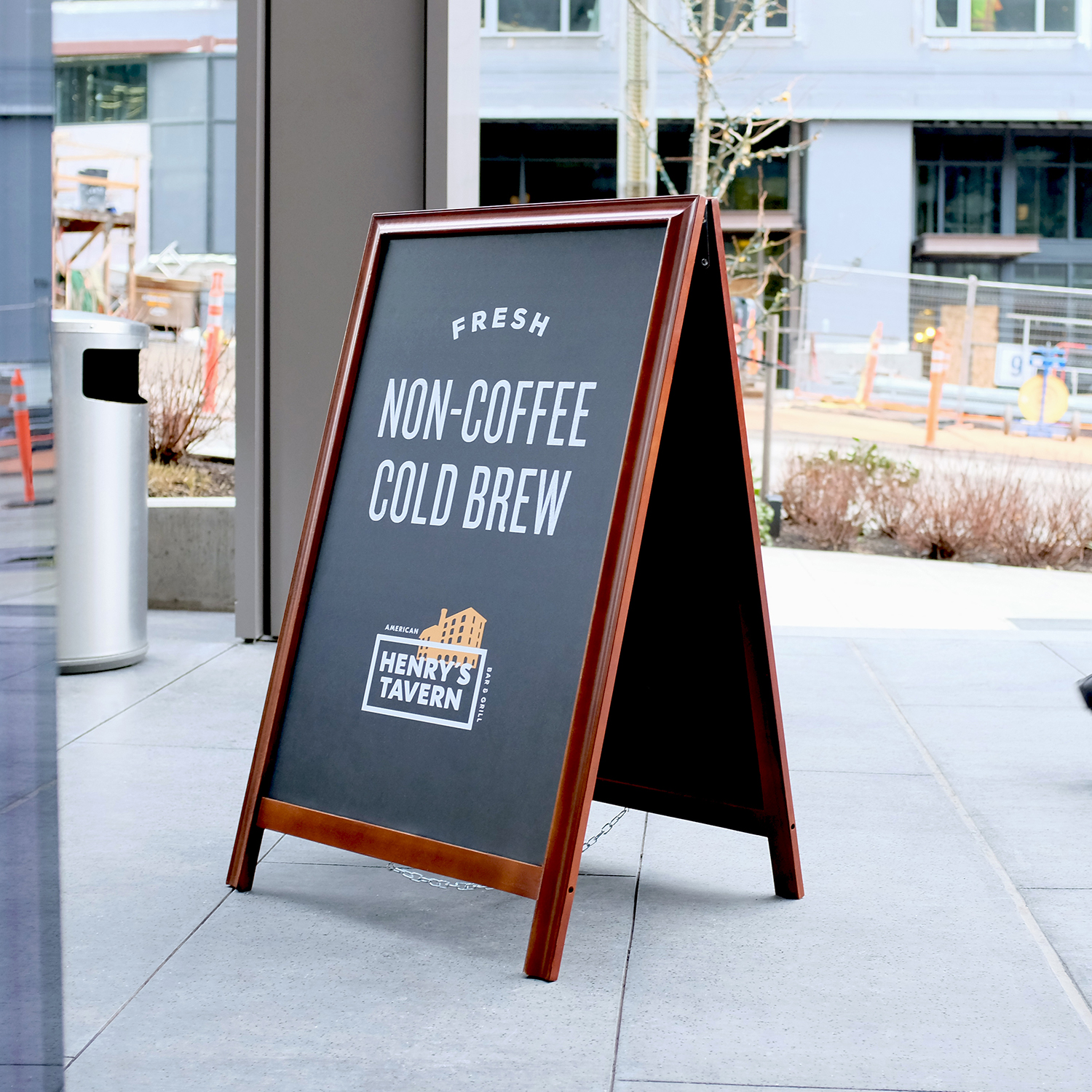
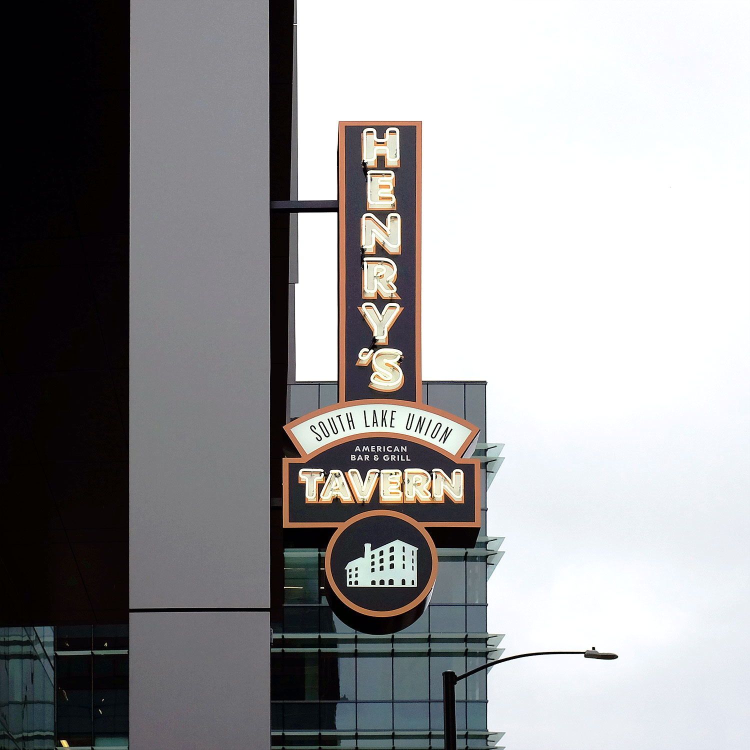
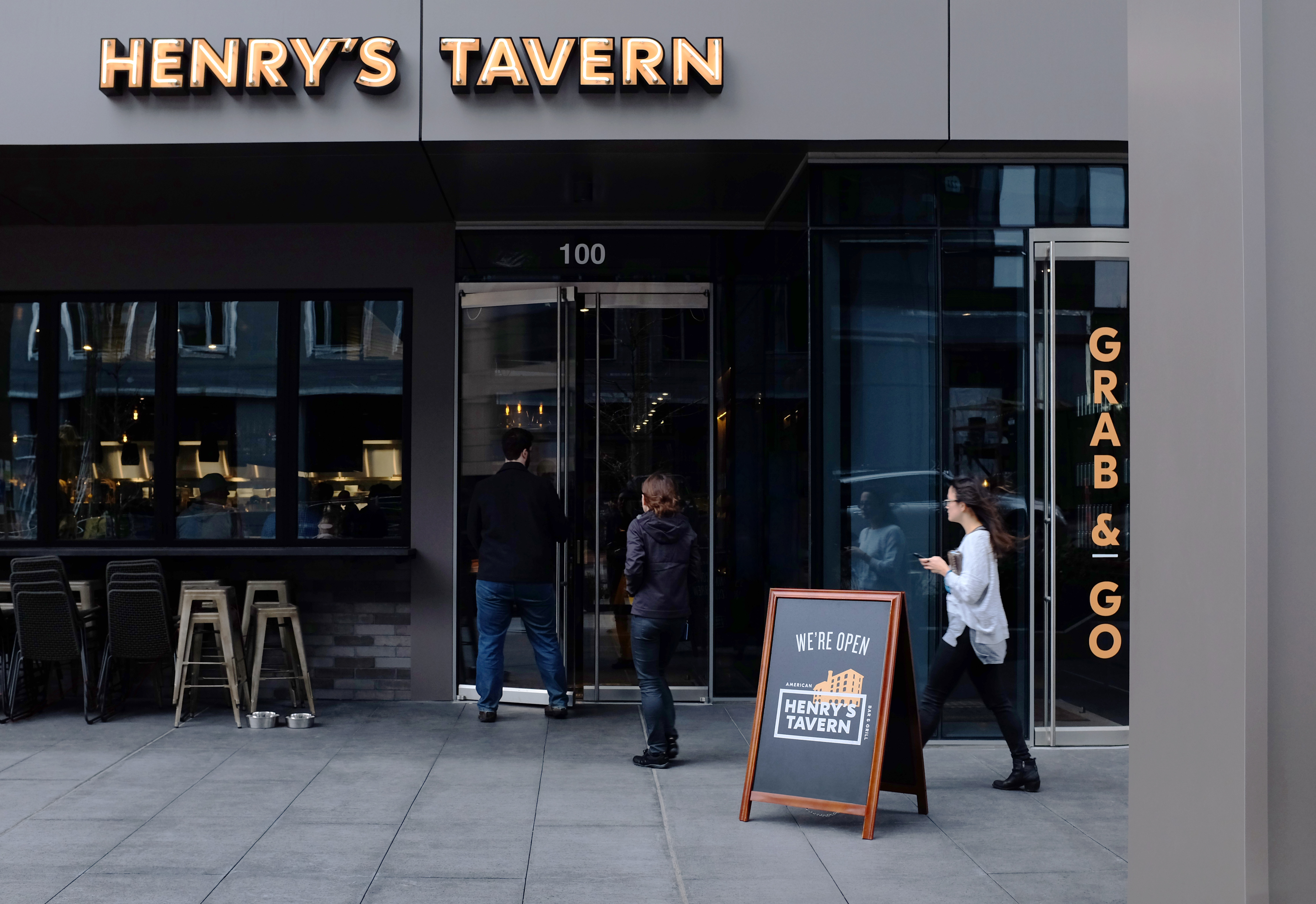
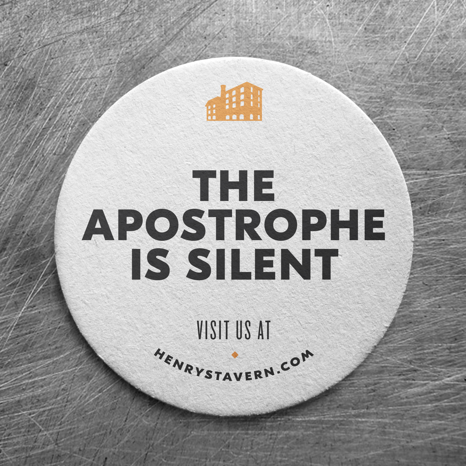
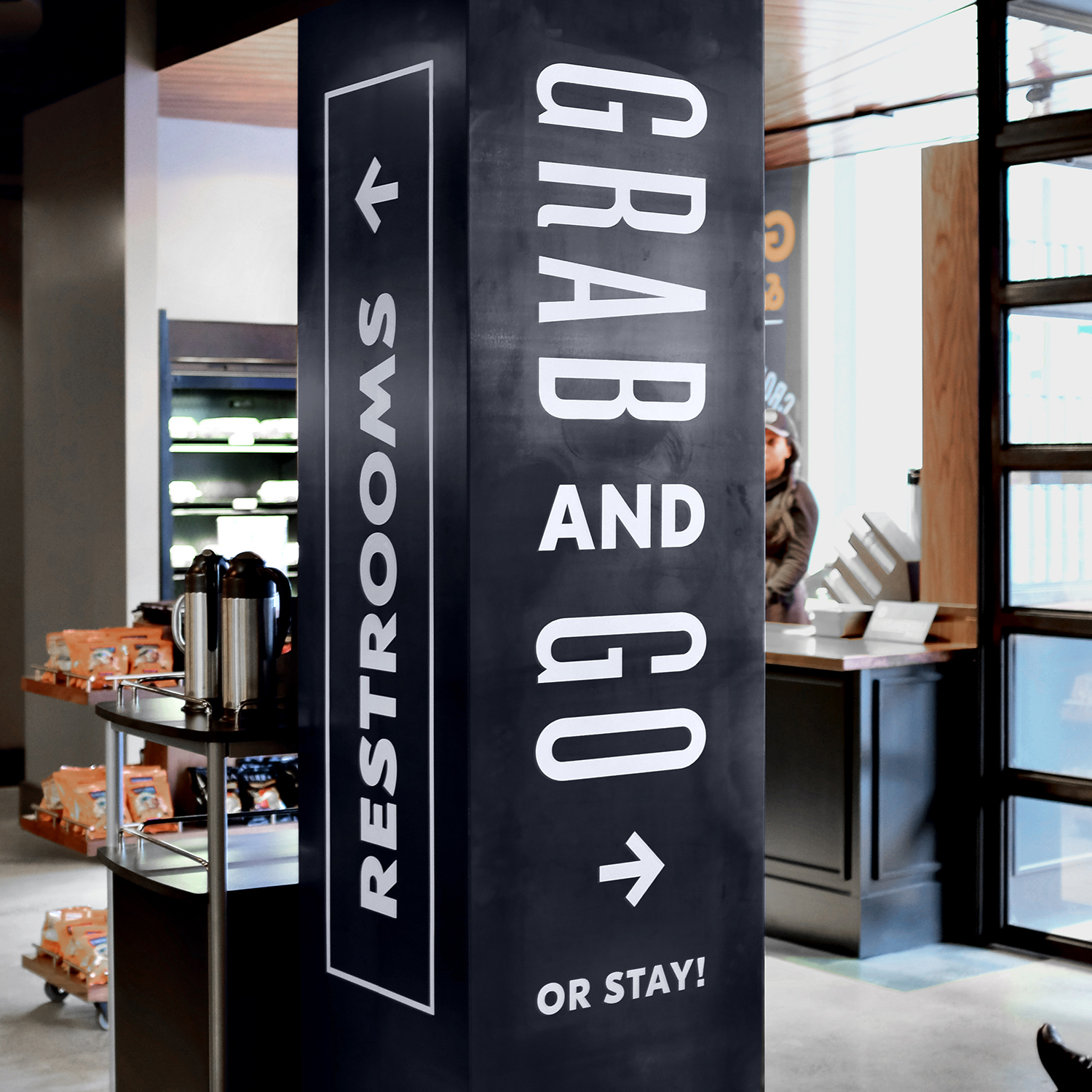
Interior and exterior signage leveraged the neighborhood’s forward-moving mindset using quick-read visuals and charming copy.
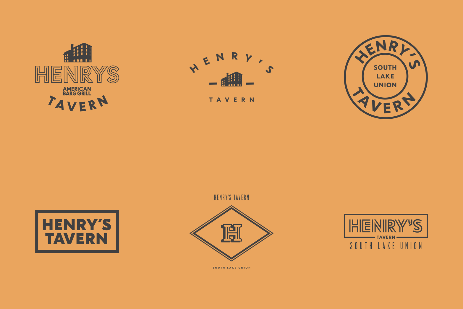
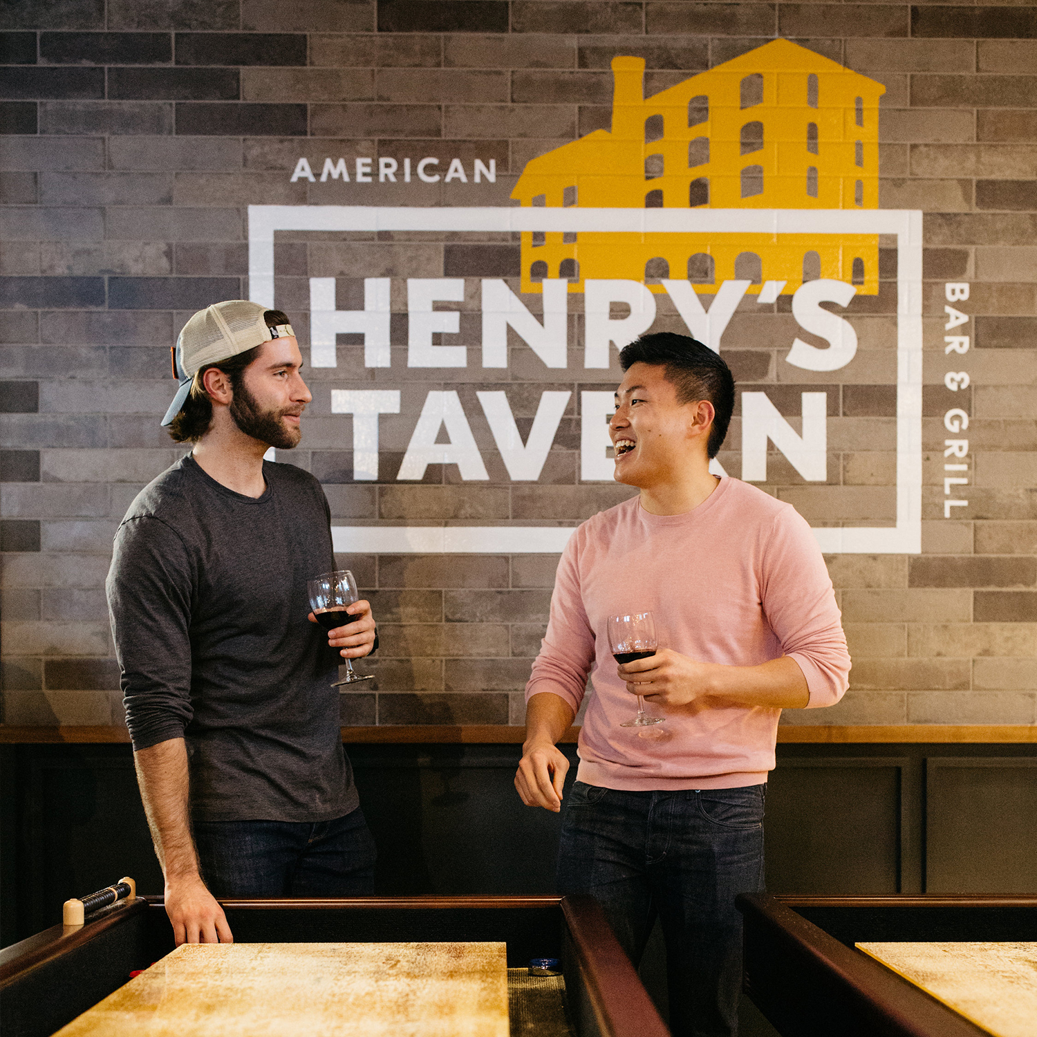
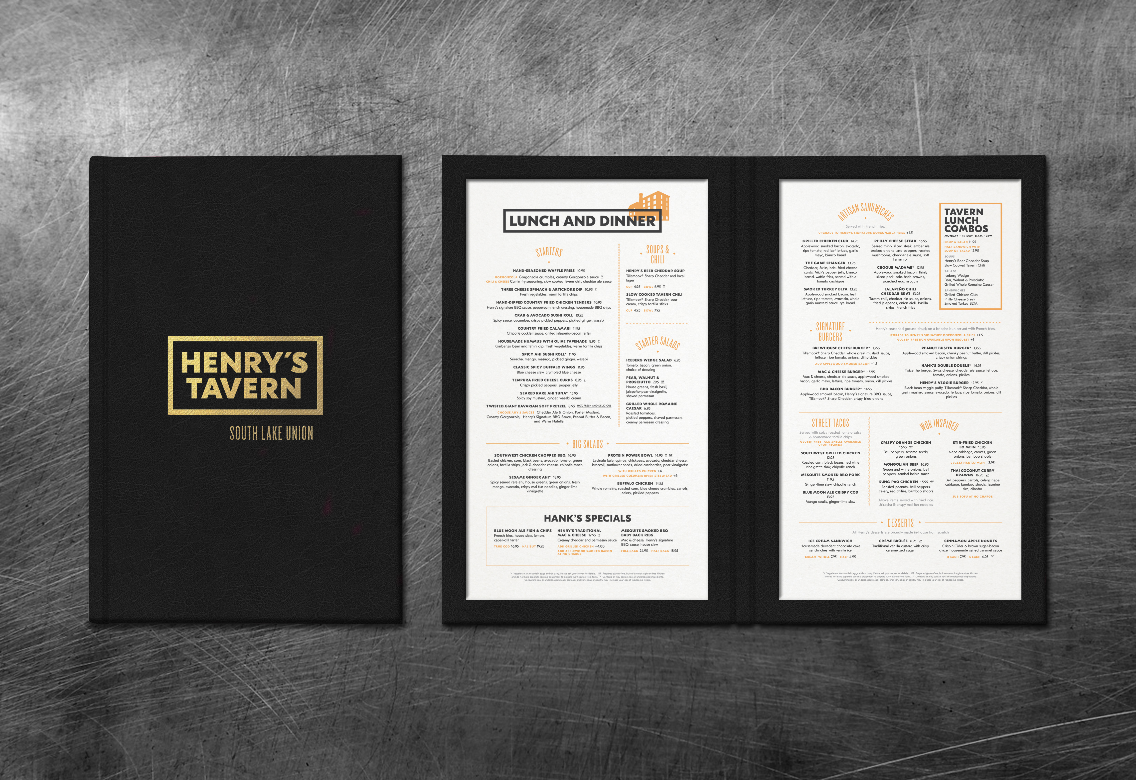

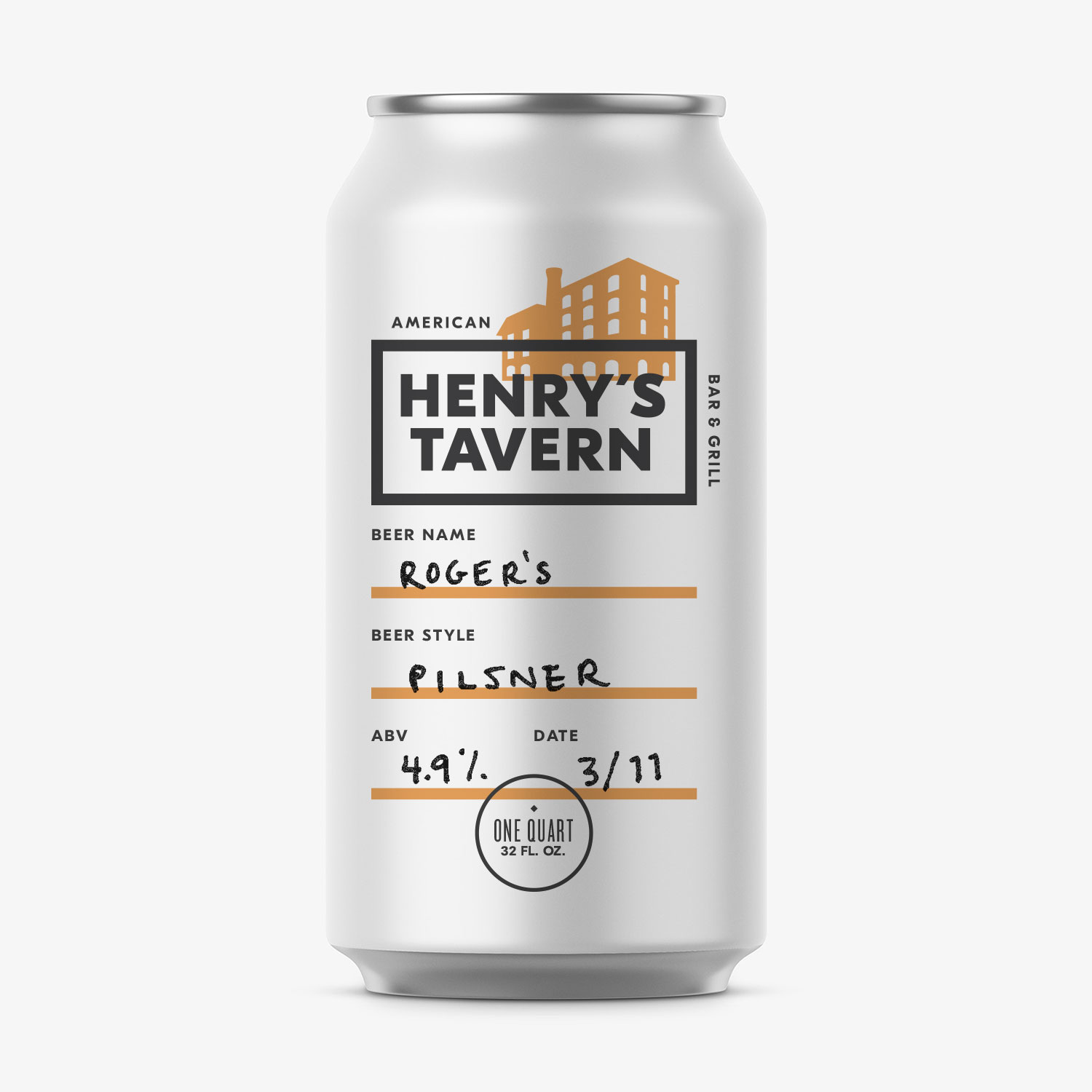
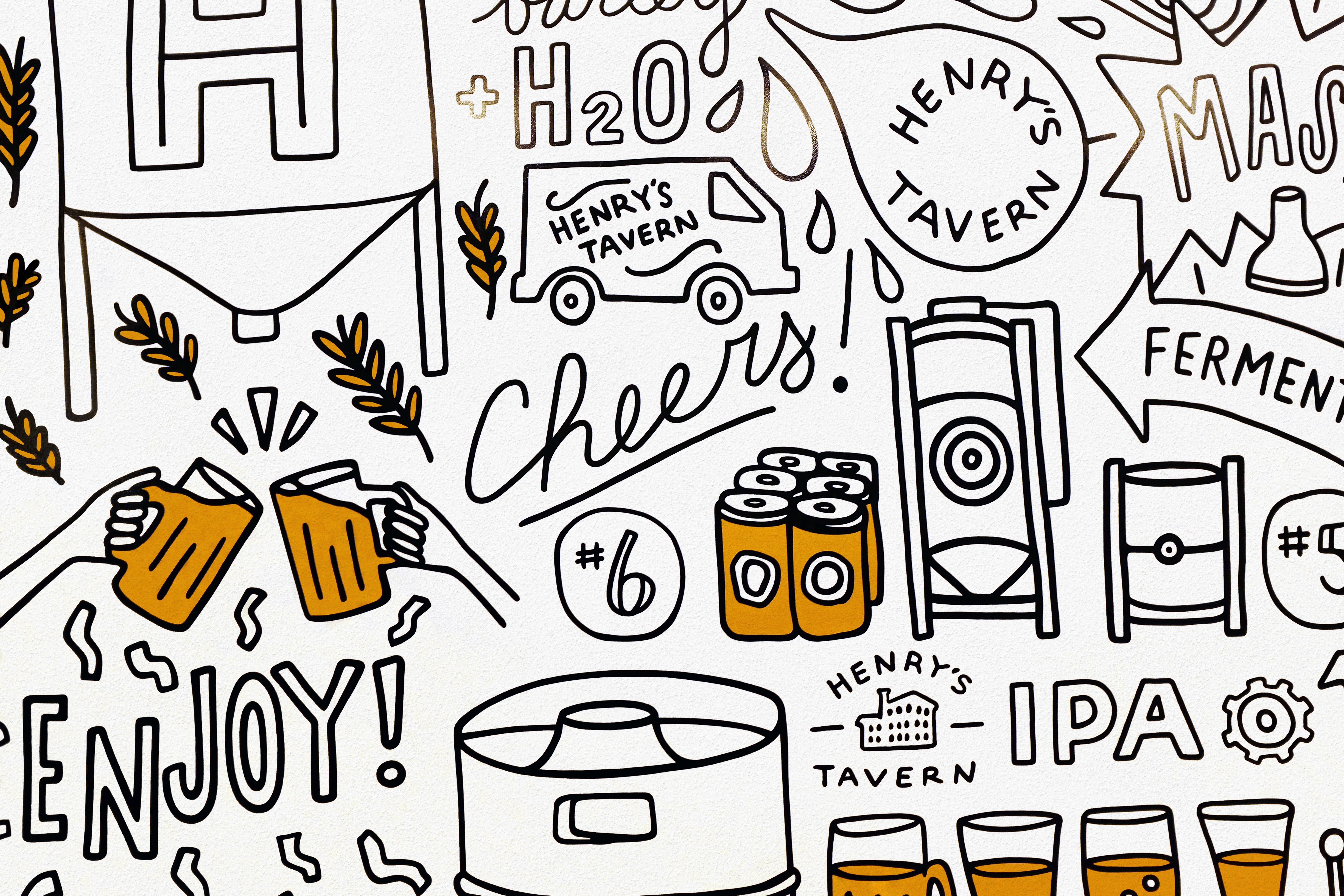
We collaborated with Atelier Drome to extend the Henry’s brand aesthetic to the interiors, and considered all touchpoints, from an expansive mural to menus and coasters to a suite of logo variations for custom growlers.
You might enjoy these, also
Electronic Mail
Physical Address
Telephone

